


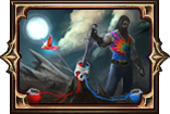
August Expansion Teaser Screenshot #2
|
pls let there be an option for the hp/mana globe ui xd. dem sexy ladies ;)
Fly you fools. Last edited by Tee_Tah#3704 on Jul 28, 2014, 8:41:03 PM
|
|
|
Wow, cannot say I like this new UI...
It is pretty bad all around imho. I can't really see how it's being considered over the old UI. -I don't like any of the buttons(less buttons is good in a way, but I really dislike the look) -the orbs are pretty meh(maybe these fit expansion theme, but pretty lackluster compared to old) -the potions slots just bother me with he little extra bit below them(and as some one pointed out, this doesn't look like it will play nicely with different sized potions). These are all first opinions on a SS tho... Maybe for some reason I will like it in game. I know it won't kill the game for me. Really looking forward to playing the expansion. |
|
|
New UI's much sleeker and more streamlined, which I like. I think I prefer the old UI's colour, since it felt "warmer" (mahogany vs. pewter, I choose mahogany).
I will agree that the shop button looks fucking miserable. Big green button on a pewter bar? No thanks I understand the desire/need to change the slave girls - though charming in their own way, they don't really match the more humanist tone of the game. The new orb characters look like they're in the style of grotesque portraits, which does seem fitting for the game. One thing I do like about the slave girls though is that they're actually chained to the orbs, and have softer lines (they curve around the orb more) - they lent the orbs a touch of "Damn, I've got slave girls supporting my health and mana? I must be important or something". The new one just feels like "Why is there a naked man in corner of my mana orb?". I'd encourage GGG to think of what creation myths may exist on wraeclast, and style the corner characters around characters from that myth. That'd likely yield more suitable orb art than rando-templar. |
|
|
+1 for the shop button being way too intrusive and the folks holding the globes being too small. They look as if someone just downloaded a comp for design purposes and then didn't bother finding larger stock images. Also, as far as the flask slots go, not sure if change beyond the colour scheme would be necessary but if yes, I would probably go with a more belt like look instead of making them look like urns lined up on a shelf in a catacomb. For me, it just really doesn't fit with the curving look of the rope and scrollwork. But I guess it's less about the look of the UI and more about a new NPC and that little "G", anyway... :-D
Exit, pursued by a Plummeting Ursa.
Finding Names for your Characters Loot Filter Colour Palettes Namen für Eure Charaktere Informationen zur Benutzung des Forums |
|
|
I like the minimal menu but the U.I just feels over all lesser to the current. Hoping for an option to use the current!
IGN: Bleric
8/8 Challenges Nemesis. |
|
|
If I could get an option to disable the friends coming on/offline it wouldn't matter what you do. Even if I don't get that option it won't matter I'm going to keep playing anyway. Now if you choose to add that option on the other hand...
Arguing on the Internet: What's the point when you can't punch them in the face when they really piss you off?
|
|
|
Question: Can we retain old UI, or at least have an option to select UI? I dont really like this new one, the big button seems cheap and too colorful for me, the statues are ugly. Got too used to current. (also wanna keep my goddesses)
The middle seems way too empty for me... or are you planning something? hmmm Oblivious Last edited by Disrupted#3096 on Jul 28, 2014, 8:40:35 PM
|
|
|
"Shop" on the interface. P2W confirmed.
"I accept Nujabes as my Savior."
|
|
" The mana potions on display here also seem to be overlaping with the borders. I suppose you're trying to give it some sort of 3D effect with perspective, but it just looks clunky. On another note, aren't the texture on the new naked models much sharper than the rest of the UI ? It feels wrong. The colors too, they just don't fit in. And that SHOP button again, doh. It's just awkwardly standing there being like "PRESS ME PLEASE ! Hope your mouse will slip so you can press me !". It should be together with the menu, with a slightly different color (that's not too bright). This feels like a lot of unnecessary changes and wasted time in my opinion. I actually hope you'll take a step back and reconsider it. |
|
|
Fixing what isn't broken.
Breaking what doesn't need fixing. :( Casually casual.
|
|


