|
If the statues are covering less in a later patch i still hope they are the girl. the templars are just i dont even.
Thanks for restoring the girl statues GGG
*EDIT*
That shop button should still be a "$" sign so it doesnt stick out like a sore thumb like aux mentioned earlier
Tears of blood, aching heart,
My dear Isildria must depart.
[Keeper] Oath keepers - Friendly EU focused guild for experienced players More info @ thread ID; 1426886
IGN; Isildria Last edited by isildria#3051 on Jul 29, 2014, 4:02:03 AM
|
Posted byisildria#3051on Jul 29, 2014, 4:01:23 AM
|
"
Why, on this very day, I have found a new reason to cry.
Path Of Exile Community Highlights
youtube.com/mireklefou
|
Posted bymireklefou#4670on Jul 29, 2014, 4:02:06 AM
|
|
Never gave the orb-girls much thought until ggg was gonna take them away! I vote for (eventually) having the option of using the girls, the guys, or nothing. Make everyone happy (is that possible?)
BLAMT!
|
Posted byZelpo#5887on Jul 29, 2014, 4:02:30 AM
|
"
Chris wrote:
Having said that, some peoples' behaviour in that thread was terrible.
i apologize for blackmailing you that i would stop posting here if you remove the ladies for good. i just thought it's not that bad and many maybe even see an advantage in it :-)
age and treachery will triumph over youth and skill!
|
Posted byvio#1992on Jul 29, 2014, 4:04:24 AMAlpha Member
|
|
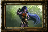
I'm pretty sure that these two characters that we see on those screenshots are mercenaries that you can hire.
Last edited by Exo666#4784 on Jul 29, 2014, 4:06:11 AM
|
Posted byExo666#4784on Jul 29, 2014, 4:04:35 AM
|
"
I'm glad the "old statues" have been restored but I'm very disappointed at your disregard for them. These aren't just eye candy, they're an iconic part of PoE. They've been there for as long as I've been here if not the beginning. They're a part of most every screenshot, video, and stream created to date. They're more than a "Legacy Item". They're a part of your brand.
Changing them goes well beyond incremental graphics updates. Beyond creating a new socket design for the colour blind. Beyond messing with previously dropped item when rebalancing (which you won't do). And I think you can see this given the swift outrage in the earlier thread and your equally swift, but still unacceptable in my opinion, response.
Changing them to fit in with current/future themes seems to me a very poor reason to ever alter them. How do you wish you altered them to fit in with SotV? I didn't expect or hope for a change or find them out of place. Did many?
Suggesting that they take up too much of the orb is absolutely ridiculous.. we've been more than managing just fine. They are not a significant obstruction. I'm not sure how you could argue that they're an obstruction at all. If you want to talk obstructions, your change to make the energy shield stretch far across the health globe for non-CI builds created an extreme obstruction in cases where you have low health and are taking chaos damage - that obstruction, you guys didn't really care about.
As for changing them because of some feedback (I assume regarding treating/portraying women poorly), I also feel this is a terrible reason. Any rational person ought to know that their presence does not condone such treatment and anyone offended by them are welcome to play another game not described as a dark fantasy. Unless you edit it all out to make it playable by a six-year-old, this game has mature and unethical or shocking things in it and it always will.
When I saw Rhys' "ikr" post, I hoped it was a joke and/or an internal privilege to test with a modded interface. When you mentioned that teaser screenshots were altered to edit out current elements, I got worried. When I saw your earlier teaser screenshot, I was disgusted - definitely not anywhere near feeling excited for 1.2. In fact, I hoped that your timer would freeze indefinitely - yes, no more content your UI change is that bad.
---
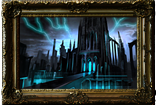
The statues aside, even this interface screenshot is lacking.
The greyscale in the teaser screenshot does look alright except for the flask section. The black half-moons and the large black areas at the top look absolutely terrible. Even just a solid light pattern for them to line up in would probably look a great deal better. Do they really need visually deep slots to fit into when they're not all shaped the same?
If you're going to have a greyscale UI, why are the menu and shop buttons not also greyscale? Why are they different colours? Why are the buttons not transparent to help blend in with the interface? Why are the buttons on different sides of the interface? Why are there bubbly gems on cast silver?
---
I'm sure you have a massive list, if you choose to keep one, of every option people ask for but if ever you implement one this would be it. Your existing UI appearance is awesome. (Well, the lower bit.. the inventory popout tab could use some love.)
You've surely weathered the worst of whatever storm there can be with regards to these statues ages ago. Why change them now? If it's for a particular locale's laws, please make the change locale-specific. I can't see how multiple UI's could be a significant burden to maintain.
I dunno Chris.. there are certainly far more pressing things to be concerned with as a player, but I look on the UI teasers and the decisions behind them in shock and disappointment.
This guy knows whats up
Tears of blood, aching heart,
My dear Isildria must depart.
[Keeper] Oath keepers - Friendly EU focused guild for experienced players More info @ thread ID; 1426886
IGN; Isildria
|
Posted byisildria#3051on Jul 29, 2014, 4:05:33 AM
|
"
The new statues will have a classical Roman look that better fits with long term stylistic goals.
Seriously? Why would you change your art aesthetic to be Classical? That's downright the worst decision I've ever heard you make.
The gray palette isn't too pleasing either.
Having a menu to hide options looks more streamlined, but isn't very practical, and why would you not then hide the annoying (and deadly) chat button, and the shop button? It's not a very enticing "shop" there, and I'm not sure how that localizes better than the dollar sign.
While all these interface changes are happening, how come you didn't fix the parts which are bad, and instead are changing the parts which are currently fine? I mean, there are non-stop complaints about the chat UI.
I honestly looked at the pixels and believed Teaser #2 to be a hoax. It is so terrible. Please don't take the art that direction.
Last edited by ionface#0613 on Jul 29, 2014, 4:39:57 AM
|
Posted byionface#0613on Jul 29, 2014, 4:08:12 AMAlpha Member
|
|
Caving twice in one day.
Nice.
If I like a game, it'll either be amazing later or awful forever. There's no in-between.
I am Path of Exile's biggest whale. Period.
|
Posted byForeverhappychan#4626on Jul 29, 2014, 4:09:50 AMAlpha Member
|
|
|
Posted byMadBro_#7856on Jul 29, 2014, 4:10:07 AM
|
|
I wonder why there has been put effort in changing an UI that was fine to me. I wonder how many people complained about the UI in the past 2 years?
I think this new Ui is plain worse, an extra click is better ? Why? I don't get it. Color change, why? A big green SHOP fits in better than a small green $ ? What?
None of this makes sense to me but yeah I guess it's me. Why bother even? All these reactions because of UI change, doesn't that tell something about how much was wrong with the old one? Yes almost nothing.
Last edited by leto2626#2588 on Jul 29, 2014, 4:11:23 AM
|
Posted byleto2626#2588on Jul 29, 2014, 4:10:22 AM
|