


Path of Exile and J!NX Shirt Design Contest
|
I don't really like the ones that say REEP, Got Dsync?, RNGesus, and the other gamer talk ones. They're funny to us players, but nobody outside the game/gaming world will get it. I think the skill tree ones that wrap around the entire shirt look kinda like they are from a bad 70's sitcom. There's probably an imprint area they should have mentioned? The designs that have the art going all around the shirt and the sleeves is too costly to print.
I like these 3 the best! " " " |
|
|
This is my submission
Spoiler
I didn't have as much time as I wanted to thislooks ulgy, but at least it gives my concept =) First one : the back, using the tree that comes from the head ( possibly the circle could be around the neck, Idk if this would be too complicated or not ), and goes being wider as it expends to the bottom ( getting closer the the eye of the one looking at it ). Second one : the front, ideal written with PoE's logo's font A PoE logo would be on a sleeve I hope people will like the idea =)  edit : working link ....  EDIT : ********* picture hoster >< sorry for that, I just noticed that it had been removed or something, lemme give it again The perspective reaaally sucks, wish I could have spend more time doing it, I event doubt that someone can really see the effect I wanted to show ( the tree coming from the top and arriving on the spectator at the bottom of the T-shirt as if it was like a fluid rushing on you, or so ). SSF is not and will never be a standard for balance, it is not for people entitled to getting more without trading. Last edited by Fruz#6137 on Jan 10, 2014, 8:39:25 PM
| |
|
This is my submission
n8 art
Spoiler
  exemple  Pvp in POE On the back of the shirt is Path of exile logo. copyright GGG, art done by me Forum pvp https://www.instagram.com/critterspencils/ Last edited by lolozori#1147 on Jan 10, 2014, 3:11:18 PM
|
|
|
This is my submission
Characters reaction to a Mirror of Kalandra drop. A "KALANDRA!" as if shouted is written above, and below is the lucky character with a victory pose. In my version its the Ranger.(Thought the sketch is black & white - the final product in color may work better) 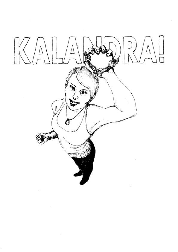 Image print location - upper front of a T-shirt. Last edited by Sting#2348 on Jan 10, 2014, 6:55:49 PM
|
|
|
My english is bad (sorry for that) and my drawing skill even worse so any picture is only reference to illustrate my ideas.
---This is my submission #1 - constellations of the Zodiac.------------------------- Idea is the shirts with constellations of the Zodiac. So it should be 12 of them. Or only one ;D im Taurus you can make that one just for me XD So the idea is really simple. Your Passive tree with some effects looks really like starry sky. And the links looks like they are in pictures of constellations. -Frame: So Stars = nods(some key build nods should be used), Links = links XD, background is starry sky, shirt colour - dark will be the best. - in 1st spoiler i used some guy hand made Picture just to illustrate coz his work inspired this idea. i credit his submission - it is on the page 7.
Spoiler
 this others are just internet pictures. The background should be NOT PICTURE like here but just starry sky!!! maybe with some more nodes as stars but less bright and not linked to constellation.
Spoiler
    ---This is my submission #2 - "too Stronk for you"----------------------------------- The slogan "too Stronk for you" or just "too Strong for you" on the chest of shirt. Big letters. With S made of 5Links-6Sockets. And some muscle power as picture if possible :) to make joke funny. So the joke is. Gamer (aka Geek) + muscle power on shirt and slogan "too strong/k for you" is already funny. But the inside joke is S is 5 linked 6 sokets and this is in fact really strong in game. So if some non-player became newbie of PoE and will meet this 5L6S guy in game he will understand that this shirt was right ;D . -Frame: Shirt with slogan and stylized S letter in it (with gems or not). Best if shirt is decorated with muscle power assosiated picture. Reference included :3 (made with Too stronk Paint Skill XD). -  + this design has PvP mood :) Last edited by yMpuCyka#4136 on Jan 11, 2014, 2:04:12 AM
|
|
" Wow, I really like this design. I like how you were able to fit in some details like the name of the quest as the tagline and the story of the plum tree on the back. Very cool. |
|
|
Last minute concept, (no art for this one).
This is my submission #3: Simple grey shirt, kind of retro style, dark blue or black text. Centered is a caged globe like that of the eternal lab. On either sides of the globe a pair of horizontal lines and "Estd. 2013" split between the sides (or the year of the closed beta). Text up top, slightly curved downwards. "Sarn & Co. Travel Agency" Text Below: "Taking you all the places you'd like to go, and some you'd rather not*" POE logo on the back and text: "(*Safety not guaranteed)" |
|
|
this is my submission #3 - the Sky
just a beautiful REAL starry sky edited with shiny passive tree nodes instead of stars. Bigger ones, smaller ones, more or less shiny.... thats it :3 Last edited by yMpuCyka#4136 on Jan 11, 2014, 2:39:20 AM
|
|
|
The competition is now over - thanks for everyone's submissions! We're going to pick our favourites in the coming week and will post updates in the news.
Lead Developer. Follow us on: [url url="http://www.twitter.com/pathofexile"]Twitter[/url] | [url url="http://www.youtube.com/grindinggear"]YouTube[/url] | [url url="http://www.facebook.com/pathofexile"]Facebook[/url] | Contact [url url="http://www.pathofexile.com/support"]Support[/url] if you need help!
|


 /
/ 
 /
/ 


