


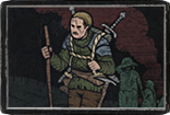
Core Supporter Pack Concept Art
|
why Concept Art more beautiful and nice than what we have...
Mercenaries master craft service Mercenaries My IGN TreeOfDead
https://www.pathofexile.com/forum/view-thread/2037371 Vouch Mercenaries veiled crafting all service all crafts mods Mercenaries SC master craft service Mercenaries SC craft mod! Veiled crafting Service Settlers craft PM: TreeOfDead |
|
|
Harvest <3
Bad Seed
|
|
|
Loving the vibes from all of this! Nice work GGG!
|
|
" A year or 2 ago they shared a post about their MTX-making process. I'm too lazy to dig it up, but the TLDR was that in their step by step process, there was no final step where the concept artist checks the 3D interpretation/final result of their art. The concept artist probably glances at the 3D results, but there is nothing in that post that would indicate that they circle back to make adjustments if the artist does not approve of the 3D implementation. So you get what you get! It is what it is. The art is always outstanding. You point out color, but sometimes the entire suit of armor is anatomically incorrect in the 3D results. The Ultimate Chaos body armor comes to mind. The art nailed it, but the 3D results shifts the entire chest section down to almost the abdomen and overall there was no actual separation between the chest and abs to indicate that you could even bend down, heh. I recall that armor because we first saw the 3D MTX and I was like wtf is this. Laster they showed the concept and I was blown away because the art was fantastic and got everything right. Edit: I found it .. and make that 3 or so years ago no a year or 2, heh. ✰CARD✰ The Survivalist I can’t buy any more big supporter packs because the forum only supports showing 7 legacy tags. Last edited by cgexile#1534 on Jan 27, 2021, 2:31:30 PM
|
|
|
I wish there would be an option for some of the concept art to be on the hoodie and t-shirt of the most expensive pack instead of the logo. That would be a better reason for me to buy it - there is never enough of interesting looking clothes, but printed art pack is something I would look at just once a while.
But maybe the rich players wouldn't buy it, I don't know. But somehow it became standard for a lot of gaming merchandises to have just their logo everywhere instead of art, I'm not sure why. Last edited by lefali#0015 on Jan 27, 2021, 4:07:05 PM
|
|
|
In summary, the art from 2D to 3D, something is lost in translation.
|
|
|
It's kind of a systemic thing. I believe PoE suffers a lot from light pollution; lots of effects are all competing for attention, and when everything is bright and so colourful, you end up with visual soup, where nothing really stands out, and everything is just jarring.
More colour balancing and standardization would be a good thing to see. This is one of the steps GGG can take to attain the levels of polish Blizzard had in their golden years. For instance Oriath square is very yellow; that might be because the tiles are made of sandstone, or perhaps the time of day, but I'm really not sure. Either way it doesn't look right. But this is kind of getting off-topic. I'm eager to see if PoE2 addresses some of this. |
|
|
really wanted the arms backpiece but the branches kind of ruin it in my opinion. would have loved it otherwise.
|
|
|
They all are and look sick ^^ You can feel the fresh PoE 2 smell from them. Substantial jump in quality. Portals and all else (sound also) too, and the person that came up with the thought to give the map device an apparition - should get a rise, genius idea ^^
/E: spelling. . Last edited by NIKOvbn#3880 on Feb 5, 2021, 10:51:44 PM
|
|
|
Thanks GGG, extraordinary quality!
|
|


