"
Sharxx wrote:
I have to say I am very happy with the Art team @GGG thats why I am glad to be able to support GGG through buying all of their MTX and the biggest support packs available. However there is one thing that really bothers me and that is that the art on paper looks way better than what we get in game, from the colors to the actual stance, to me it seems like those sets were designed for characters that we arent playing ingame, now I know this post was about a concept and not 1:1 what we got but I mean the finished product says something else.
To give you a good example I have included a screenshot that compares the Dominator Armor set (highest tier) ingame and the concept art because thats the one armor set that stood out to me the most, especialy since people pay so much more money for it.

On the screenshot you can clearly see that there is something wrong with the shoulders on that armor they are facing down unlike the concept art which looks alot better in my opinion, from the colors to the actual design, the orange color is way to overpowering for the whole armor and should be tuned down a bit otherwise its soon gona compare with the phoenix set and I dont want to see them fight against each other lol. But seriously the worst thing are those shoulders I love to mix and match mtxs to get a nice result at the end and so far I have not found a use for that body armor the shoulders just ruin it, and you have to keep in mind that this is on a marauder the most bulky character with broad shoulders they should be able to pull off alot more armor sets just by their physique in game but even they look like this, and you dont even want to imagine what this armor looks like on a skiny witch, atrocious. So at the end of the day all that I am using from this set is the helmet because the body armor is an abomination in color and design as far as shoulderplating goes and I cant really use the gloves and the boots because the colors are to bright on the orange - which is fine not every armor has to match with others and obviously people also dont have to like all the armors, but this is on a whole new level, the only thing that would make this worse if GGG sold armour sets with their concept art and then you see a entirely different result ingame, but thankfully GGG is transparent enough to not do that.
Sry for the rant folks, but I feel like this should be said and I feel like I have the right to atleast share my opinion since I bought it, maybe the art team can take something away from this and we all win at the end. Definitely love all the other sets from the supp pack so it was definitely a success overall, the art team just tripped at the finish line. :)
Oh and on a sidenote I wonder if we could get new character models in the next expansion, I mean they seem kind of outdated tbh, *cough* looking at the npcs that look better than the players. Obviously not high on the priority list, but you know. lol
Take a breath ffs.
Neden yaşıyorsun?
|
Posted byJideament#2792on Jan 8, 2018, 5:52:13 PMOn Probation
|
|
Nice work! <3
|
|
"
webas wrote:
What about scholar blue portal? It was there in previous ggg post. What about it? It looked great and it was as if stolen from supporter pack. WHY??
All of this! I'd buy the pack right here and now if it included that portal.
|
Posted byLilLaskaris#6217on Jan 8, 2018, 5:59:01 PM
|
|
Can WE as players get some of the armor's from this post? I'm tired of all this anime crap armor.
I want big slabs of steel armor. I want a walking tank.
And on the flip side, could we get more robes and fabric clothes for the magic users. Again, all these wings, and glowey bits are fine for the China Cluster, but I'm not into Anime.
|
Posted byKillcannon#1275on Jan 8, 2018, 6:19:38 PM
|
|
cute
|
Posted byDeletedon Jan 8, 2018, 7:03:49 PMBanned
|
"
Sharxx wrote:
I have to say I am very happy with the Art team @GGG thats why I am glad to be able to support GGG through buying all of their MTX and the biggest support packs available. However there is one thing that really bothers me and that is that the art on paper looks way better than what we get in game, from the colors to the actual stance, to me it seems like those sets were designed for characters that we arent playing ingame, now I know this post was about a concept and not 1:1 what we got but I mean the finished product says something else.
To give you a good example I have included a screenshot that compares the Dominator Armor set (highest tier) ingame and the concept art because thats the one armor set that stood out to me the most, especialy since people pay so much more money for it.
On the screenshot you can clearly see that there is something wrong with the shoulders on that armor they are facing down unlike the concept art which looks alot better in my opinion, from the colors to the actual design, the orange color is way to overpowering for the whole armor and should be tuned down a bit otherwise its soon gona compare with the phoenix set and I dont want to see them fight against each other lol. But seriously the worst thing are those shoulders I love to mix and match mtxs to get a nice result at the end and so far I have not found a use for that body armor the shoulders just ruin it, and you have to keep in mind that this is on a marauder the most bulky character with broad shoulders they should be able to pull off alot more armor sets just by their physique in game but even they look like this, and you dont even want to imagine what this armor looks like on a skiny witch, atrocious. So at the end of the day all that I am using from this set is the helmet because the body armor is an abomination in color and design as far as shoulderplating goes and I cant really use the gloves and the boots because the colors are to bright on the orange - which is fine not every armor has to match with others and obviously people also dont have to like all the armors, but this is on a whole new level, the only thing that would make this worse if GGG sold armour sets with their concept art and then you see a entirely different result ingame, but thankfully GGG is transparent enough to not do that.
Sry for the rant folks, but I feel like this should be said and I feel like I have the right to atleast share my opinion since I bought it, maybe the art team can take something away from this and we all win at the end. Definitely love all the other sets from the supp pack so it was definitely a success overall, the art team just tripped at the finish line. :)
Oh and on a sidenote I wonder if we could get new character models in the next expansion, I mean they seem kind of outdated tbh, *cough* looking at the npcs that look better than the players. Obviously not high on the priority list, but you know. lol
It is to bad that the actual product doesn't look as good as the original concept. I might consider buying if it didn't look so clunky.
Saved
|
Posted by60x7#2399on Jan 8, 2018, 7:05:28 PM
|
|
Looks good!
It will convert your forum titles into decorative square badges that use the space next to your forum posts more economically so that you can show off an unlimited number of them at any one time. - GGG, 2018 (https://www.pathofexile.com/forum/view-thread/3573673)
|
Posted byJerle#2906on Jan 8, 2018, 7:26:20 PM
|
|
Super nice
|
|
"
60x7 wrote:
"
Sharxx wrote:
I have to say I am very happy with the Art team @GGG thats why I am glad to be able to support GGG through buying all of their MTX and the biggest support packs available. However there is one thing that really bothers me and that is that the art on paper looks way better than what we get in game, from the colors to the actual stance, to me it seems like those sets were designed for characters that we arent playing ingame, now I know this post was about a concept and not 1:1 what we got but I mean the finished product says something else.
To give you a good example I have included a screenshot that compares the Dominator Armor set (highest tier) ingame and the concept art because thats the one armor set that stood out to me the most, especialy since people pay so much more money for it.
On the screenshot you can clearly see that there is something wrong with the shoulders on that armor they are facing down unlike the concept art which looks alot better in my opinion, from the colors to the actual design, the orange color is way to overpowering for the whole armor and should be tuned down a bit otherwise its soon gona compare with the phoenix set and I dont want to see them fight against each other lol. But seriously the worst thing are those shoulders I love to mix and match mtxs to get a nice result at the end and so far I have not found a use for that body armor the shoulders just ruin it, and you have to keep in mind that this is on a marauder the most bulky character with broad shoulders they should be able to pull off alot more armor sets just by their physique in game but even they look like this, and you dont even want to imagine what this armor looks like on a skiny witch, atrocious. So at the end of the day all that I am using from this set is the helmet because the body armor is an abomination in color and design as far as shoulderplating goes and I cant really use the gloves and the boots because the colors are to bright on the orange - which is fine not every armor has to match with others and obviously people also dont have to like all the armors, but this is on a whole new level, the only thing that would make this worse if GGG sold armour sets with their concept art and then you see a entirely different result ingame, but thankfully GGG is transparent enough to not do that.
Sry for the rant folks, but I feel like this should be said and I feel like I have the right to atleast share my opinion since I bought it, maybe the art team can take something away from this and we all win at the end. Definitely love all the other sets from the supp pack so it was definitely a success overall, the art team just tripped at the finish line. :)
Oh and on a sidenote I wonder if we could get new character models in the next expansion, I mean they seem kind of outdated tbh, *cough* looking at the npcs that look better than the players. Obviously not high on the priority list, but you know. lol
It is to bad that the actual product doesn't look as good as the original concept. I might consider buying if it didn't look so clunky.
I had a similar post here as it related to the Ultimate Chaos chest. They screwed that up as well when you compare it to the concept art which was pretty awesome. The artist designs the armor so that it's anatomically correct and looks like it could function. The 3D guys take it and fuck it up without the concept artist having a final say to suggest that it's actually fucked up. I'm not a fan of the Dominator chest but I don't think they butchered it as badly as they did the Ultimate Chaos chest or the Pure Light chest. You can see that in the concept art the midsection looks like it has give and play so that the upper abdomen can ride behind the pectorals, but the 3D guys seem to have a hard time translating that over so instead they put out a giant chest piece that looks like it's all one piece of armor for the torso, and sometimes that sits so low (Pure Light) it's just funny that it gets approval for release.
The good news is that most of the time they do a nice job - on designs that are a bit less complex or detailed :)
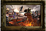
✰CARD✰ The Survivalist
I can’t buy any more big supporter packs because the forum only supports showing 7 legacy tags. Last edited by cgexile#1534 on Jan 8, 2018, 8:17:33 PM
|
Posted bycgexile#1534on Jan 8, 2018, 8:02:02 PM
|
|
Can you please answer for a question - WHY THIS ALL NOT IN GAME? Why you change scholar suporter and entire design, why you change redeemer portal, etc, WHYWHYWHY ???
...God damn if you listen to community post answers for this question. Because I really like game, I start supporting from Harbinger and what I see from company that most supported and loved by people. I see that company go for 'Hats,chests - Gabe Way'. Why you do this ? Why just dont make your players happy ? Damn I purchase redeemer for portal and points but I very much want this portal for scholar and this arcane particle glowing set. It's sooo cool looking with my ED char. But not, some ugly metalic parts no portal etc. Entire concept looks like sex and designer and painters have my applause and love, but manager team, people who decided to cut and cheap, they have all my hate and anger. You guys worst.
...just give art team do what they want and dev team to do what they want and take all our money, is it hard...
Last edited by ENSOWA#6081 on Jan 8, 2018, 8:24:14 PM
|
Posted byENSOWA#6081on Jan 8, 2018, 8:15:50 PM
|