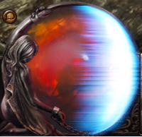
New energy shield feedback
|
I like it as it is.
Only leveled till lvl15 witch or so, so don't know at higher levels. IGN: Gonorreitor
|
|
|
I think the new look is both impractical and unattractive and would like to see a return to something closer to the old shape and placement.
|
|
" I just realized that the shield looks different depending on how much shield you have. This is the shield I was referring to above:  I think this looks much less offensive:  Though I still think the old placement was better. |
|
|
the image is too large. it takes up too much of the health orb.
hey, how about this. instead of taking up half of the orb, like how it takes up the right side now, how about have it be an animated visual where it goes from the middle of the orb outwards. as you take damage the size of the circle goes down and when your orb is off it makes a sound and then the visual is gone until your shield recharges. |
|
|
- The old energy shield was clearer and more functional. Re-work the energy shield to something similar so it doesn't interfere with seeing health and is crisp vs ragged edges. - The health and mana orbs are too tall and wide with a lot of wasted space as it extends too far above the rest of the HUD. |
|
|
I actually found the current design to be beautiful. That said, I think having it overlay the entire health globe is the main concern. If chaos damage is happening, it's bypassing the mechanic, which makes it harder to notice. Especially so in hardcore where you are paying a ton of attention to living.
It's less obtrusive when it's just on the right side of the health globe. Graphics wise I thought it was great. |
|
|
So far I really like it. I am not sure how much of the health globe it ends up taking up, but mine is not quite halfway. I can see the health fine, and the look of it is awesome. I hated the little bar in the old version.
|
|
|
ok here's my idea. I quickly made a gif as to where the energy shield to me would look best on the new ui. Placing it next to both the mana and health orbs (I think) helps you see it a bit more. Just one suggestion...
http://i52.tinypic.com/30lmavn.gif |
|
|
Couple thoughts on this. I haven't seen how the energy shield grows or how big it potentially gets, since I'm new, but basing off of the comparison shots Gilligan posted earlier, my feelings are this:
I like the idea of the visual more than a separate meter, because personally I think it'd be important to be able to gauge what your shields are relative to your life. Not sure how the current formula for the size of the shield visual works, but if it, say, took up half the orb if your max shields were equal to or greater than your max health and progressively less as the ratio got smaller, I think that'd be neat. Two biggest problems with the visual as-is, as I see it, isn't that you can't see your health, but that your eye is drawn away from your health. The shield needs to be a bit less bright so that it doesn't immediately draw your attention to it and only it. Having it be semi-transparent would probably also help. |
|
|
i like the new vision of energy shield !
|
|


