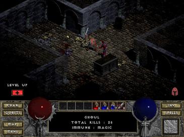
PoE first impression: Feels like 10 year old game...
|
This is actually a very important topic and i think that even though POE has some really good graphics there is still room for improvement.
" The graphical outcome someone sees actually means two things. The technical stuff concerning the engine used for the game and that means the Polycount, Material Shaders and On Screen Effects and Filters. The graphical style adopted for the game. So as for the actually technical part even though i haven't played D3, as far as i can judge from the screenshots i see, i believe that in terms of polycount POE actually uses a higher number and the engine used, also looks quite capable in the Material/shader part with very good results in bump mapping and the glossiness used. I'm quite sure that what you see as a difference in graphics is actually a difference in the art style of POE with most of the latest MMOs and ARPGs out there. So i think it will be more accurate to say that indeed POE seems to have a more gritty/dark/realistic art style that was abandoned some years ago and seems to have been replaced by a more colorful art style in most cases and that's imo due to the effort made to make games more appealing to the younger players. This color variation though creates a "fake" impression of a better graphical result to most people if done right. What i think can be done to make the game visually more appealing, rich, alive and complicated without hurting its art style focus is to add : - A few more small colored light sources such as small gems emitting light - Interior magic fires, camp fires etc. - Magic glowing wall writings - Magic glowing floor symbols - Floor cage-like tiles breathing fire or gasses every few seconds. - Moving Fog with a variation in density. - Falling leaves and other plant parts moved by the wind in the exterior levels. - Dreeping water, falling rocks for the interior levels. - Small cracks on some dungeon roofs that will let a few lines of light enter and many more. Finally they can add - Some more exterior ground elevation variation. - More points of interest such as the one in the broken bridge level. Last edited by georgatos7#2505 on Jul 1, 2012, 12:37:51 PM
|
|
" So much this. I don't think this is even something people do consciously. When I first started playing I remember thinking the game didn't look much better than d2, but then I went back and played it and realized I was way off. The only people who reallly think this game has 10 year old graphics are the people who haven't played those games in just as long. Rose colored glasses and all that. Diamond Supporter since 2012-04-24.
|
|
" Exactly... I would take it as a compliment when people say PoE looks like d1/d2. The graphics of PoE are outstanding and people don't seem to see it that way because of the artistic style used. "A communion...but with what? By all accounts, it wasn't God that the Vaal were trying to reach." -Icius Perandus
|
|
|
PoE graphics is good but the UI and animation could use some improvements, IMO.
|
|
|
People sometimes say that the animations need improvements, however I've never seen anyone posts a short clip of an animation and highlight exactly what they find wrong with it.
People have done so with the UI, but because animations require special programs to capture, nobody seems to bother actually slowing down the animation and explaining what is wrong. If you have account problems please [url="http://www.pathofexile.com/support"]Email Support[/url]
| |
" As much as I love PoE, I have to admit the combat animations feel somewhat sticky and slow to react. I've seen many people point this out and I think GGG has taken note of it. "A communion...but with what? By all accounts, it wasn't God that the Vaal were trying to reach." -Icius Perandus
|
|
|
OK, I might have sounded too harsh, the game isn''t looking like diablo 1 or similar games. The world has much better graphics.
But look at for example the map. Or the items. Or the outlines around enemies or NPC's. Not really a modern look. Again, this is not criticism or meant badly. Just my opinion. I am enjoying the game, and I think it has huge potential: the itemisation seems to be really good! |
|
|
the only thing wrong with PoE Gfx is camera is miles to close to action THATS why it looks like a old game.. there lots of threads all wanting more zoom out (more than 1-2 meters like in a old patch!)
Bonan..2hander,Miss Bitch..whitch, ThongBow..ranger
|
|
|
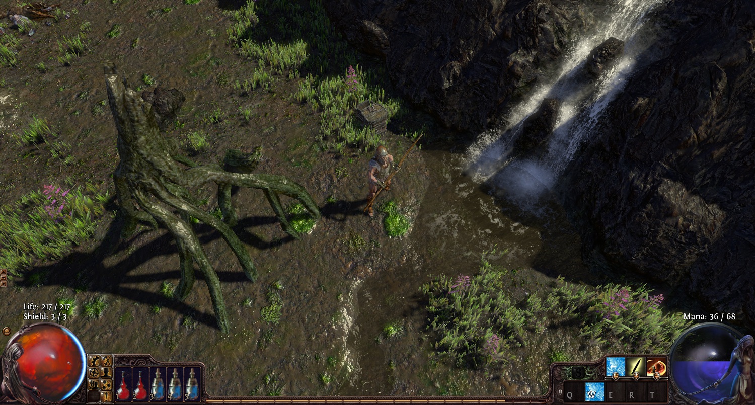
I dun give a rat's backside how "modern" PoE looks. It looks good! As for details, a lot of what you miss can be seen if you zoom in; there is rainwater running down the tree trunks in Fellshrine, for example. The devs have put that much love into the graphics in the style which they have chosen to portray their world.
PoE isn't perfect, but it's still head and shoulders above that Other Game (ten plus years and many millions of dollars in the making), whose players should wish that all they had to complain about was the graphics. =^[.]^= =^[.]^= basic (happy/amused) cheetahmoticon: Whiskers/eye/tear-streak/nose/tear-streak/eye/
whiskers =@[.]@= boggled / =>[.]<= annoyed or angry / ='[.]'= concerned / =0[.]o= confuzzled / =-[.]-= sad or sleepy / =*[.]*= dazzled / =^[.]~= wink / =~[.]^= naughty wink / =9[.]9= rolleyes #FourYearLie |
|
|
In my view the "pixels" can remain the same, in certain ways I like this detail more. Compared to D3/Torchlight2 and the WOWlike looks, it has a potential to be far far superior. The problem is having more fluid character/monster movement and that would be a HUGE plus. As it is now, it's somewhat rigid and manikin like.
GW and GW2 makes for something to look into. Having the cartooney flow without cartooney looks, while maintaining detail is something to aspire to. |
|