


The Ultimate Chaos Armour Set - An Insight into the Development Process
|
I was lucky enough to get most of the chaos set and it is really good looking, though i still don't get why that spiral in front was chosen over some of the other iterations, it highlights some weird looking model stretching going on which apparently made it through QA!?
... but definitely one of the more interesting boxes. ps. although this is a nice box I hope GGG dont go too much down the road of bulky armours. The earlier sleek ones where so much cooler. Last edited by daFalk#6581 on Sep 5, 2017, 3:22:54 AM
|
|
" those prices are from a time when your mtx did represent the amount of money you supported. long gone now. could be cheaper, yes. but if everything is cheap what motivation do you have for people to overspend? age and treachery will triumph over youth and skill!
| |
|
While I'm not too fond of the design itself (too visually noisy), I'm happy to see a big part of the pipeline to create it (especially the very early 'crude' concept; too often companies only show the highly-polished end results of the design process as 'concept art'), so thank you for this post. <3
|
|
" We apologize for having a job with enough income to afford anything we want without checking our bank accounts before purchasing useless mtx. Sorry. 7777777777777777777777777777777777777777
|
|
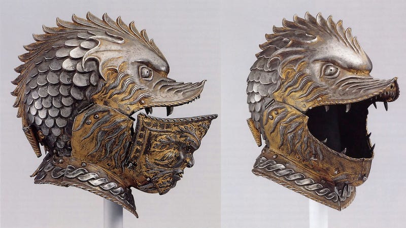
" Nothing bad about beign bulky, a want a warrior to be bulky if i play some melee duelist build (and i play only melee builds to be honest). And duelist lacks this bulkines. Still, blizzard style is really a plague that should be vanished like a horrible nightmare. I know alot about ancient and medieval armor and how it should look so all those fantasy elemnts that have no practical function or will even cause a warrior a bunch of problems in a real fight look odd and ridiculous. I love poe for non-anime grafics unlike D3 (well, Grim Dawn also has a bit of this cartoonish style, but i play it because they did not ruin TQ spirit, leveling system, hudge loot drops an varienty of builds, everything i liked in good old TQ). Moreover, i am so pleased with PoE rare and unique items. Alot of their models have been taken from history and introduced into the game, for instance Samnite helmet was used by gladiators that belonged to Samnite type, Secutor helm was used by gladiators that belonged to Secutor type, Fencer helm, Lacquered Helmet, Pig-Faced Bascinet, Soldier Helmet, Crusader helm, Aventail Helmet, Eternal Burgonet - they all existed in medieval Europe. And GGG made very accurate models btw. Even Nightmare Bascinet has a real prototype, you may check https://i.kinja-img.com/gawker-media/image/upload/s--CFowk4yO--/c_scale,fl_progressive,q_80,w_800/18penzxtjn5wmjpg.jpg Or take a look at those repiers and sabres. They are perfect. I hope this trend will continue. Last edited by _TaZaR_#1953 on Sep 5, 2017, 4:03:58 AM
|
|
" This should be int he chest https://vignette1.wikia.nocookie.net/warhammer40k/images/4/4a/Tzeentch_Icon_small.jpg/revision/latest?cb=20110402074804 |
|
|
Love the shoulder pads. More please
End it 👌
|
|
|
We're sick of the recent trend towards bright, cartoony RPGs. The art style we chose for Path of Exile is dark, gritty and realistic.
We're sick of the recent trend towards bright, cartoony RPGs. The art style we chose for Path of Exile is dark, gritty and realistic. We're sick of the recent trend towards bright, cartoony RPGs. The art style we chose for Path of Exile is dark, gritty and realistic. We're sick of the recent trend towards bright, cartoony RPGs. The art style we chose for Path of Exile is dark, gritty and realistic. https://www.pathofexile.com/game |
|
|
Can you show us concept art of the armour from next supporter packs?
ign: Bikvin
|
|
|
Looks nice in video, but actually when I try to equip it on any of my characters - looks too fat for anyone.
Have it, never used it because of that reason...Same with "light" armor, it's just there. |
|


