


www.grindinggear.com website... what? (Update: quick design uploaded)
|
Before I ask, I dont mean to make anyone mad, especially the web team coz they did a great job on this site :P
BUT what is going on with the company website? its... hmmm... *trying to make it not sound nasty* Its.. you know what i mean :P Is there a chance you will be updating it soon? (updating the look i mean) P.S: before any members start trolling saying "bet u cant do better etc." I am a Web Developer, do dont bother :P --------------------------------- Yuuki --------------------------------- Last edited by yuuki on Sep 15, 2011, 8:55:45 PM
| |
|
If you are a web developer then you are aware that functionality and simplicity are two important facets of web design, and the case currently stands that their website has both simplicity, ease of use, and functionality, seeing as it does not need to represent any specific product or provide a staging point for anything except informing you about who they are and how to contact them.
Likewise they do not need to appear, outwardly, as anything more than that, as they do not have potential employers or the like to appeal to. They are their own company. It's a perfectly effective website that does exactly what it needs to do and no more than that, which is perfect. My writing/adventures through Path of Exile
http://ryukaki.com | |
" I understand what your saying about functionality, simplicity & ease of use, but the website is a factor of company image. Im not meaning anything to with functionality or usability, its a small site with basic pages, so functionality is basic, and so is usability. I just thought they could show their Image more, as im most likely right when I say this, that their website as it stands today, is not their image. ---------------------------------
Yuuki --------------------------------- | |
|
Yuuki you should submit a mockup to GGG of how you'd like to see it done.
Be proactive! My mind has a mind of its own.
| |
" Im actually sitting here thinking about that lol, but it difficult when you have no information or thoughts about design/layout or the image of the company (apart from PoE) Ill have a wee think about it whether i should or not ---------------------------------
Yuuki --------------------------------- | |
|
Yes, our Grinding Gear company website is pretty noob.
Even the content on that website is glaringly out of date. Many have many more staff now than are on the staff page and some of the people on the staff page have now left. The problem is that updating that website is right at the bottom of our priority list. In terms of attracting players, we spend a lot of time making this website good, but we have put almost no time into the company one. Path of Exile II - Game Director
| |
" Pretty legit answer if I do say so myself, Time spent on that site is time spent away from this game or this games site which is something that should be higher priority. But taking a couple afternoons to do a quick brush up on your companies page may not hurt either. People interested in your company may look at the page and just kinda shrug at it. | |
|
Ok, I threw up a wee design and ill say a little bit about it. Of course I do not know what they want, and images in this are taken from google :P so keep that in mind.
First of all, the background behind the body is a very light grey texture which is easier on the eyes and also makes the part of the page that are white stick out more. There is also a fade shadow around the wrapper area which gives it a good blend into the background and not just a cut. In the navigation you will see that the "Path of Exile" is light - this is just to show you what the hover & current page tabs look like. On the right I was thinking of seperating that from the left content of the page and have some information or pictures about Path of Exile, and then in the future, you will be able to scroll through the other games that will hopefully be created :P I kept it simple & kind of grey/black/white colour theme. Any critisism is valuable critisism :) P.S sorry you have to scroll to see it all :P If you copy the image and paste it into a graphic program you will see the whole thing. Edit: I put a water mark diagonal "Yuuki" incase you wonder what that is :P 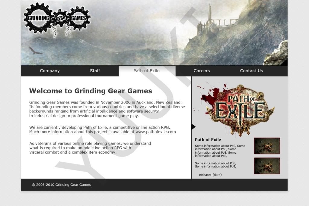 --------------------------------- Yuuki --------------------------------- Last edited by yuuki on Sep 16, 2011, 7:30:26 AM
| |
|
Anyone else want to throw up a mockup design for GGG?
---------------------------------
Yuuki --------------------------------- | |
|
Not bad, same base idea but improved over imo.
Last edited by DiNo29 on Sep 16, 2011, 8:34:07 AM
|


