IMO the new shop button makes the game look like another random cheap F2P, here's my suggestion
 Last edited by PoExchange on Jul 29, 2014, 6:47:52 AM
This thread has been automatically archived. Replies are disabled.
|

|
|
Looks pretty good but people might not recognize it as button at all.
|

|
" $ was an indication of something that it is shop. Your suggestion though,though i like the idea,is not fit because of 2 reasons. 1)this seems as it is part of the Ui and not something clickable 2)Not many will recognise this icon as the coin we all know,especially the new players that want to buy something. So $ is quite bad,as.....well you tell by looking at them,well...its something to pay,cant explain the feeling. Also mind the chinese market,they dont want to see this dollar at all,also dollar sign is not representative of the whole world economy. Shop in the other hand...dont know either..Maybe this coin icon alongside something to acompanie that this is the mtx icon,maybe would be better Bye bye desync!
|

|
|
Maybe a one-time tooltip hinting at that button later on in the game, maybe when people beat Brutus?
Something along the lines "When you are satisfied with your experience, you are welcome to drop some bucks for cosmetic Microtransactions!" Would disrupt the gameplay only once instead of looking like a plague for the rest of the game. |
|
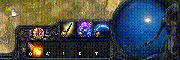
" Since GGG said that they plan to introduce a tutorial when you start the game, they could explain the UI (and this button) as well. Oh, and here's another version, someone on reddit suggested this change to make it look a little bit more like a button.  | |
|
my feeling exactly... i liked the suggestion of moving the shop thingie below the arrow of the menu also but this is way better, having it at the skillbar looks so out of place and a move one of those f2p pay to win games would make..
I dont understand their decision really..having a really noticable shiny box with SHOP written in it works for the stupid facebook games which want to tempt you into spending some money every second you play..PoE is not p2w god damnit , i as a player would never be tempted by that being so visible , why should i ? I would be rather annoyed and i would lose immersion , imagine this: In the heat of a fight where you are struggling to survive and kill something bam you look at that SHOP and in that moment everything is lost , whoever will look at screenshots and videos and things like that will thing oh LOL look at that stupid SHOP right there bye bye cya without even stopping a moment to realise how good the bussines model is.. i would do it , i still do it when i see gameplay videos.. Making players feel grateful , making them feel good on achieving something THATS how you persuade them to buy that cool looking mtx , the deal of the day notification in the login screen is a good way..THIS ..this is just stupid and i think it will just make PoE lose potential player -> potential money other than making them earn anything.. The dolllar and the GGG coin thingie are both symbols and they make you feel much more comfortable and immersed when you play and they dont affect a potential player looking at a video/screenshot at all, we understood that the problem was that the dollar sign wasnt recognised everywhere but this should be visible and recognizable while not causing any of the above mentioned problems. EDIT : As for the "it doesnt look like a button" argument i think that making it bigger and a bit more noticeable than the environment around would definetely make players curious ..After that they would find out the shop is not something p2w at all , outside viewers wouldnt get it at all and thats not a probleem at all Last edited by MadBro_ on Jul 29, 2014, 4:50:31 AM
| |
|
I agree, the SHOP button would worsen the perception of the game by strangers.
It certainly looks like a normal F2P cash-grab thing. |
|
|
I hate that button!
Looks cheap and out of place. I allready dropped 200$ on this game, way more than on any other of my games because I really like it. But this " hey were going to temp you into buying something by putting that button right in your face!" Makes me sick. If you plan on keeping it that way at least give everyone who allready found the shop the option to hide the button.... I and i think all of the guys who spent money on this game dont need a remindr at THEIR EFFING SKILLBAR! Please keep it serious it is totally out of line with everything you do otherwise from s design point of view. I dont usally talk like that but it had to go. Regards | |
|
I don't understand what was wrong with the $ button. I was small, didn't ruin the UI, I liked it. Why change things that worked. Change is not always necessary, I don't like changes without any valid argument behind it. The "dollarsign doesn't fit the theme" is nonsense, a real money shop will never fit the theme because it has to be recognizable else people won't use it. I think it was perfect.
| |
" It doesn't fit the localization efforts probably. |
|