


Visual imperfection of energy shield
|
Energy shield doesn't perfectly fit on life orb.
 I know that its a minor mistake, but we always see it and our eyes often catch this imperfection. Give it some love. "The only thing necessary for the triumph of evil is for good men to do nothing" - Edmund Burke
This thread has been automatically archived. Replies are disabled.
|
|
|
Lol, this is high priority for sure. ;)
|
|
" Adjust coordinates X and Y where that shield design should be placed (move a bit up and left). I am not a game programer, but thats probably less than 30 minutes work :) "The only thing necessary for the triumph of evil is for good men to do nothing" - Edmund Burke
|
|
|
Coordinates are fine. It's just the energy shield radiance bleeding into and beyond the health globe's edge to make it look like it's actually energy/light and not just a color variation within the globe.
The effect being the strongest in the middle makes it look misplaced at a first glance but the same thing happens in nature.  Source Rotate the image 90° to make it more obvious. |
|
|
Wow, owned by wordling. Nice work bro.
VI |
|
|
Wordling, did you completely miss the fact that the energy shield is actually misaligned vertically?
Actually, I think the Life is also misaligned as well. I might be wrong IF the life & energy shield are meant to be "held" by the statue, and the "arc" above it is not meant to be part of the orb, but just something around it? Forum Warrior - Why are you creating a thread about this subject? Use Search! Also Forum Warrior - Nice necro. Last edited by Nurvus#6072 on Apr 30, 2014, 5:10:40 PM
|
|
|
The energy shield is perfectly aligned.
Why? Because it is aligned to life, nothing else. If anything, the life pool isn't aligned with the life orb. |
|
"The "arc" seems more or less like a large, thick, ring surrounding and securing the orb so it is somewhat part of the orb but not quite. Regarding the proposed misalignment. It's really just a visual phenomenon deceiving you into thinking the ES portion has a different shape than it actually has. On top of that, it completely obscures the exact edge between health globe and "arc/ring" making assessment of where they all intersect with each other more difficult. Let's look a health globe with a much lower ES/Life ratio:  Here we clearly see the ES starting at the very edge between the life globe and "arc/ring", slightly bleeding into both, more intensive towards the center of the globe, less so further up and down until it completely disappears. It's worth noting that the ring seems to extent beyond the visible screen edge which leads me to the assumption the last 1-2% of life are just pixels away from the edge of your screen. Compare that to a solar eclipse (spoiler) and imagine the moon to be just a little larger so that the halo only extents to to roughly half the moons circumference. Then add a ring around the moon with a tiny gap to let a bit of the light pass through and bleed into the ring and moon(globe) by its sheer intensity and voila: Energy shield.
Spoiler
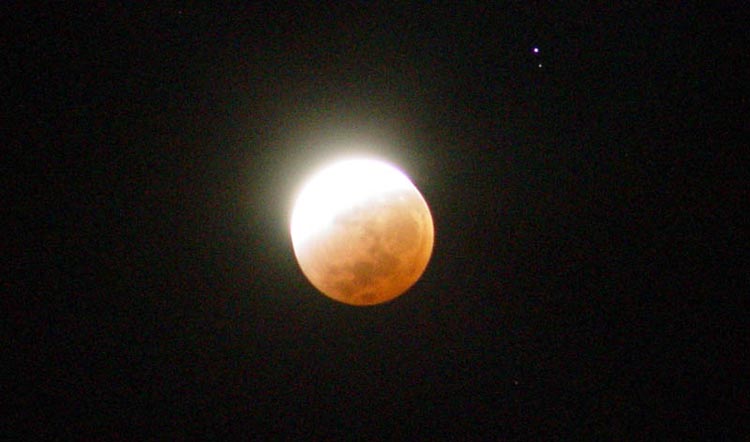
 I'm starting to think this is exactly where they got the idea from. Edit: Have an Overexposed image of a Lunar eclipse to for a much simpler example of what is going on. Since there's no difference between "doesn't pass light through" and "doesn't reflect any light", empty space around the moon is functionally identical to an "arc/ring/whatever" sorrounding it. One can see how overexposure causes the sunlight to bleed way into space making it hard to discern where the transition between space (arc/ring) and lunar surface (the orb itself) takes place, obfuscating their actual shape and alignment. Last edited by wordling#2814 on Apr 30, 2014, 6:58:28 PM
|
|
|
Yeah I guess the problem is the UI Arc/Ring is bigger than the Orb.
It does show that the Orb is matching the Energy Shield in both cases once you understand that. Forum Warrior - Why are you creating a thread about this subject? Use Search!
Also Forum Warrior - Nice necro. |
|


