


[Fan Art] The Witch
|
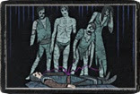
so, kind of waiting for act 4, all my work recently has just been endless text layouts and graphs and corporate yawnings, so I thought I'd partake in a little photoshop shenanigans.
Small preview  full size
Spoiler
 hf :) I love all you people on the forums, we can disagree but still be friends and respect each other :)
|
|
|
Snorkle dude, you rule.This is awesome.
|
|
|
Totally loves colours of dat
|
|
|
Woah, really nice!
My supporter items: Victario's Charity and The Forsaken
|
|
|
cheers guys.
I do a lot of DVD covers etc for work, involves a lot of mashing together photographs so you learn a few tricks about using colour overlays and shifts to knit a collage of photographs together, I kind of like doing it to digital paintings just to give it that little something. I love all you people on the forums, we can disagree but still be friends and respect each other :)
|
|
|
Nice,
But just as i looked, instatly poped up wrong element order around head. Lighting is top side of tree, while cold in right. Besides that, perfect. would place as wallpaper if aspect ratio would be proper :) Last edited by anbra#3385 on Jul 6, 2015, 12:21:19 PM
|
|
|
:D
thing is shes a dagger witch using an aegis and hatred, cold is her element and +max cold res is her resist situation.
Spoiler
 my more recent temple one would probably be a better shape for a desk tho. I love all you people on the forums, we can disagree but still be friends and respect each other :) Last edited by Snorkle_uk#0761 on Jul 6, 2015, 5:30:52 PM
|
|
|
Long time I have not look works in the showcase.
Like usual Snorkle top work, really like the textures and hatches effect. There is a nice grain on the image, it is kind of cinematic and a little psychedelic. The other 3d witch is also great. Forum pvp https://www.instagram.com/critterspencils/ Last edited by lolozori#1147 on Jul 7, 2015, 2:32:10 AM
|
|
|
cheers.
The grain is also something I started using to 'fix' problems with photo montages for dvd covers and general photochopping where you bring together photographs and images that are scaled differently, shot on different cameras in different lightning etc. Its basically generated noise that is set to 'overlay' in the blend mode of the layer and then I turn the opacity right down till you can barely notice it at 1:1 actual size zoom. You just fill a whole layer with exactly 50% grey (half way between pure black and pure white), when you set that to overlay is should literally disapear and have no effect on the picture. Then you go to filter > noise > add noise and set the noise level to somewhere between say 5 and 20. You end up with this, 1:1 size on the left and zoomed in on the right  you then turn the opacity right down. What it does essentially, and Im about to use some wishy washy touchy feely art nonsense lingo, is 'sharpen' the image, 'bring it into focus', 'blend it together'... Its the same thing you do with sounds in digital music, you add subtle amounts of the same sort of distortion to all the sounds to give it a unified tone, sharpen the sounds and knit them together. Its like seasoning for digital art, a little shake of msg. This is what it looks like up close  and from that sort of zoom it almost seems like ur bluring the details but when you zoom out to 1:1 actually makes the image look sharper and more consistent. It makes sure each pixel is subtly different to the one next door like its all shot through the same camera and its real, if you like. It smooths over some digital workings at the same time  no noise on the left, noise layer added on the right, a lot of the brush strokes and pixelated edges of lines are nicely blended over and at the same time sharpened up, like an anti blur that somehow also blurs. I use it on almost everything now days if you look closely at them. One of many cheats I employ :D. When Im sketching something with a banboo Ill oftne set up the noise first and then sketch under it, make sit feel a lot more like pen on paper and less digital and fake, dunno if that makes sense, less plastic. I also chucked a load of dust motes into the witch pictures, a ton actually in the original post were in, wanted it to look like stars, which is what my dust motes usually are, google image search stars, screen mode, hard contrast it.   I love all you people on the forums, we can disagree but still be friends and respect each other :)
|
|


