


LOOT FILTER Contest: Currency Coloring
|
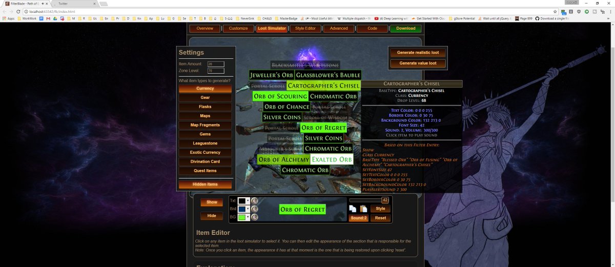
Warning long post: check the last spoilers, if you're only interested in pictures :P
I believe you may have a very wrong concept of "QoL". I believe you're providing quite the opposite of a QoL situation. The goal of QOL improvements is making a system more intuitive and pleasant to handle, without changing the function. I think we can agree on the following ideas, based on simple psychological (and AI-programming) observations:
Spoiler
1) Filters are technically a language. A way to communicate the user about the qualities of certain items using certain identifiers. As with any language - it's way easier to learn, if it follows rules and appears logical to you if you know the rules.
2) In fact QOL are usually exceptions that BREAK rules to provide functionality. Yet if you DO break rules - you should have a really good reason for it. Making Alchemy Orbs and Exalted Orbs BOTH max-sized is a QoL improvement. It partially breaks the rule of "More Valuable = Larger", to provide easier pick-up. 3) Our brain has 2 general behavior patterns (very, very simplified). "Learn" and "Recognize". In general, we prefer to recognize over learning (learning is harder). 4) It's way easier to learn, if you can recognize some already present rules (starting out new things is always the hardest part). We learn by observing distinguishable patterns. 5) It's way easier to recognize, if the difference is easily distinguishable. Red and blue are easily recognizable. The difference between "cyan blue" and "light sea blue" not so much. 6) We tend to learn easier, if the outcome is interesting to us. The problem with coloring currency individually and introducing tons of difference is: you break the rules 2), 4) and 5). You introduce patterns - I see that you tried to give the labels, the colors of the item-icons - yet this part is not something directly interesting to the player and they're hard to recognize. This creates the first impression of "a mess" - too much information at once, with no context, it's like reading a book in an unknown language. You may understand it, but most people won't bother struggling through it - because it's hard and doesn't introduce direct benefit (rule 6), such as easier farming. The style-benefit is very, very subjective. Some people will enjoy it, but more often than not, people will not. So here’s my advice:
Spoiler
1) Group more. I recommend introducing common color-groups or common size groups. However, those can’t be too subtle, otherwise it will look messy.
2) Keep all colors well readable. Basic: The right contrast is key. Advanced: vision impairment considerations, gamuts, social perception differences, bias. 3) Understand that a lot of this is very subjective. There’s a certain median of perception out there and most people appreciate. Don’t assume that people will have the same perception as you though (also applies to everything I said, I might be just wrong). For some reason you have the assumption that people will have the same impression from one of the most subjective thing int he world - colors. 4) Introduce logical progressions. Color spectrums. Scaling is very important to give the user context. 5) Don’t go too way far from the original colors EVERYWHERE. This makes learning much easier. You can introduce new colors and aspects, but leaving some things the way they were helps a lot. This idea works especially well with common items. 6) Value function. Everything you do should be function driven, if want to share a product - even as an artist - the question WHY - is important. Examples:
Spoiler
  Please don't PM me ingame with filter/guide questions, post them on the forum, after reading the FAQ. Last edited by NeverSink on Oct 18, 2017, 6:56:27 AM
| |
" Forgot that I could easily just remove the surplus items in the filter debugger, so here's just the currency:  Bird lover of Wraeclast
Las estrellas te iluminan - Hoy te sirven de guía Te sientes tan fuerte que piensas - que nadie te puede tocar |

|
" Hey Neversink, I agree with some of what you said. Not trying to argue or quibble, but I'd like to respond to some things. - I don't assume ppl want their currency colored. I'd say probably fewer than 5/10 people want this. - You said 'This creates the first impression of "a mess"' vis-a-vis the coloring. And I agree; it looks egregious to me when it's presented as a display of everything, and I'll be the first to admit that. - Try it. The experience of trying it is different than the experience of being bombarded by all those colors, all at once. It is an honor, sir, to have such a venerated member of the community, known for his Item Loot Filter expertise, commenting on this humble thread. Best, bwam - 0 * - < _ > - * 0 -- 0 * - < _ > - * 0 -- 0 * - < _ > - * 0 -- 0 * - < _ > - * 0- 0 * - <
<739610877-3104-376.101077-1106.75103739110792103.108-5'92.9410776.> - 0 * - < _ > - * 0 -- 0 * - < _ > - * 0 -- 0 * - < _ > - * 0 -- 0 * - < _ > - * 0- 0 * - < |


