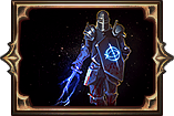
New UI Mockup
|
looks great :)
| |
|
The interface presented seems good; while the icons next to the health circle are small,it adds to the somewhat minimalistic interference of the UI to the actual game screen.
| |
|
That's pretty awesome ... scale-able ofcourse ??? :P
Last edited by MarlonB on Aug 24, 2011, 1:21:41 PM
| |
|
It's looks great, but the energy shields is a bit too bright for me.
| |
|
1 word: AWESOME!
| |
|
Really nice looking UI :)
There is one thing tough, I am one of thouse who thinks D3 disepoints me, but there was one thing I liked in the game. They had animated the HP and mana pool. It would be cool to have a small animation in them here too. Some kind of an "inner" animation in the red and blue colour that makes them feel more alive. Lost where no man has been lost before.
| |
|
holy necro thread, Batman. As they say.
Anyway, I agree. I love the oily swirls in the mock-up and wish the in-game UI had something like that. Warhammer 40k Inquisitor: where shotgunning is not only not nerfed, it is deeply encouraged.
Dogma > Souls, but they're masterworks all. You can't go wrong. I was right about PoE2 needing to be a separate, new game. It was really obvious. |
|
|
There.. is still that little... gem beside q...
WHAT IS IT.. I clicked it a 1000 times.. it didn't moo... ya someone necro'd this, but wish we had those item renders they look better imo. Last edited by Neokolzia on Apr 30, 2012, 8:04:42 PM
| |
|
damn, i'm liking the new UI. :-)
|

|
|
Nice bump...
But seriously I like Path of Exile's UI the best of all ARPGs including Diablo 3. However I do envy the swirly life and mana... "It's a harsh, difficult world. You have to be prepared for it. We're not babying the players." - Chris Wilson - Producer, Lead Designer @ Grinding Gear Games Last edited by Wulfenstein on May 1, 2012, 2:06:16 AM
|

|