Some specific changes from the last iteration are:
- The new menu button has been improved.
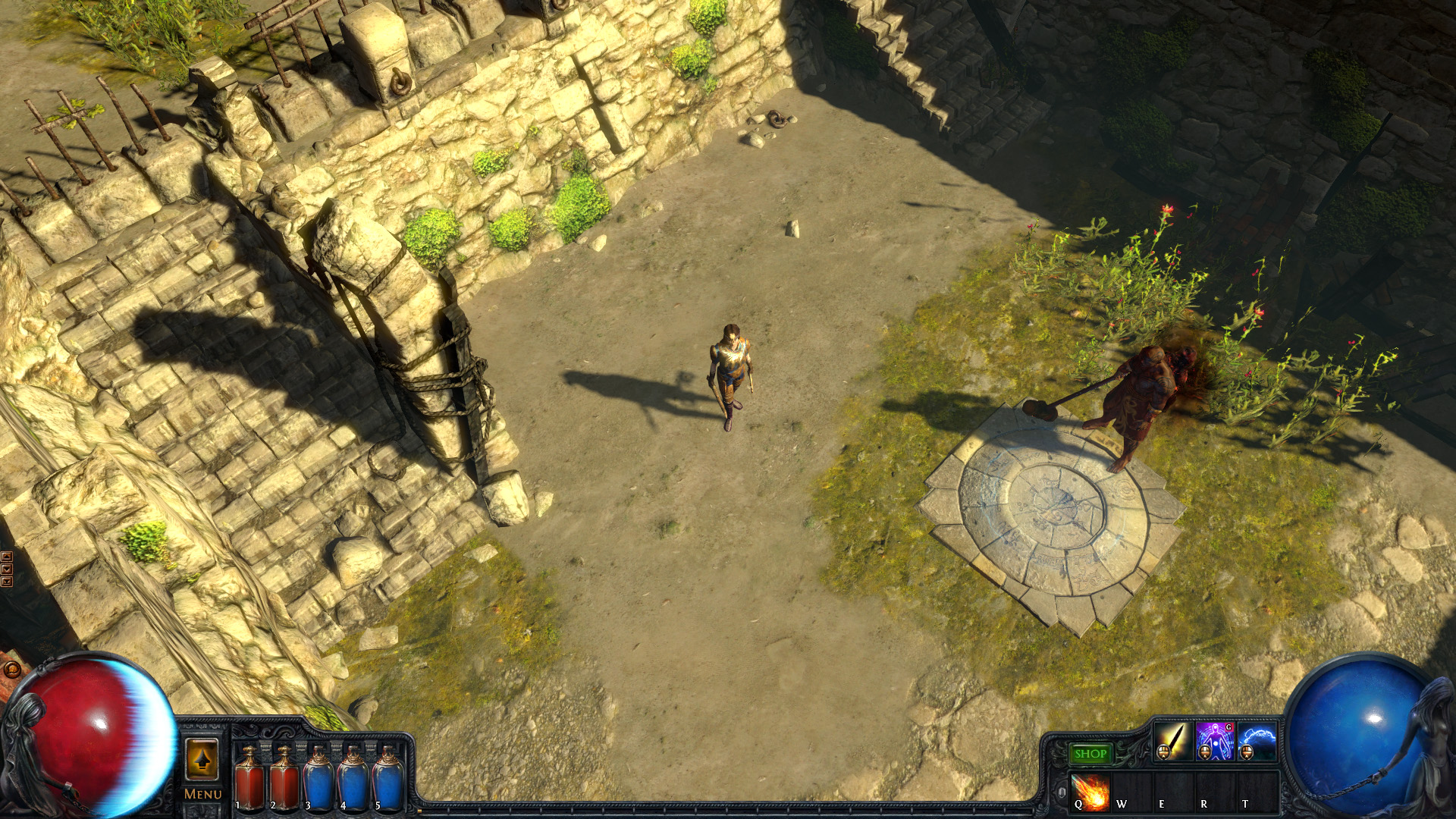
- The shop button now fits in better with the rest of the UI and doesn't stand out so much. The reason it's wider now is because the dollar sign was immersion-breaking and didn't localise well into other languages.
- The old statues have been restored. We still intend to remove them in favour of ones that cover less of the health/mana orbs, but have moved this to a longer-term change. The new statues will have a classical Roman look that better fits with long term stylistic goals.
- The redundant word "Screen" has been removed from most menu options.
Click the image to see a larger version:
 |
Posted byChrison Jul 29, 2014, 2:09:50 AMGrinding Gear Games
|
"
Chris, why are you listening to the forum at all? Haven't you stated that the forum only represents a fraction of the total player base?
It is a change that affects the whole player base.
We changed it away from the new statues because we agreed with some of the feedback. We're trying to be very clear that they're going to change again in the future.
We listen to all our players. The forum only represents a small fraction of total players, but the feedback is absolutely taken on board. Having said that, some peoples' behaviour in that thread was terrible.
|
Posted byChrison Jul 29, 2014, 2:19:04 AMGrinding Gear Games
|
"
Hmmm, the G support gem on clarity is now red when in the last screenshot it was green...
No, in the previous screenshot it, along with the entire skill icon it's on, was in greyscale because Chris was in town and his skills were disabled.
|
Posted byMark_GGGon Jul 29, 2014, 2:39:57 AMGrinding Gear Games
|