


The webpage (background) artstyle - less commercialism needed
|
Hey guys, I especially hope someone from the staff will notice this and give their oppinion.
I would like to ask you if it is realistic to await a change of the webpage (background) artstyle. I will explain myself. The old one ( http://i.imgur.com/4quBh.jpg ) was very good, precisely the right side of it. It gave me a feeling of something long forgotten and abandoned, now lying in dust surrounded by the mists of unknown nightmares. Also it reminded me a drawings created by Santiago Caruso in "The Dunwich horror" book (by H. P. Lovecraft) - I will get back at these names later. I consider the new background cheesy and a bit cartoonish, more appealing to the masses (althought you have stated you are focusing on the hardcore players, so I was surprised when you have changed it. I know you just can't place dead babies everywhere:) but still, this has been a pretty ... sad change considering what I have felt at that time). And yeah, I know gameplay and the website design are completely different things, but it would be really great to have also a stand-out website directly spiritually connected to the darkness we enter via the gameclient. And I would browse poe.com just from the sheer joy of contemplating. So I would literally fly out of my pants if you consider a change back to less commercial style. More .. weirdness, desperation and horror feeling. Because this doesn't do game any justice, it creates a too much of a generic look (not mentioning what would newcomer think - "yeah, i saw this somewhere already") and PoE itself looks entirely different ingame so it is sort of misleading. These are some of the drawings inspired (mostly done by Santiago Caruso) by the universum created by Lovecraft - your artstyle resemebles it a bit so I hope you can find a time to get some inspiration and blow our minds with your art ! :) And I also think it would perfectly match our beloved dark & gritty world. 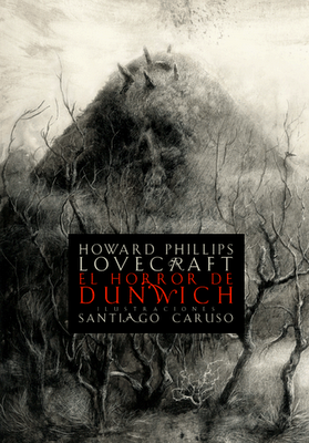           You can find more drawings here : 1. http://estou-sem.blogspot.sk/2011/08/as-profanas-surreais-e-aterrorizantes.html 2. http://damnamazingthings.blogspot.sk/2011/07/dark-illustrations-of-end-of-world.html 3. http://site.douban.com/widget/notes/189315/note/99792097/ 4. http://3.bp.blogspot.com/-7ilaBbvqR94/Ts4Xjn78DLI/AAAAAAAAEPI/_TxHshyJ4S4/s1600/ww%2BSantiago%2BCaruso.%2BWunderkammern.jpg 5. http://www.mizzenmast.fr/wp-content/uploads/2011/01/car_1-619x891.jpg Last edited by sakalthor on Jul 8, 2012, 6:20:26 PM
| |
|
Nice post.
I support this idea. IGN: Mayon
__________________________________________________________________________________ Never argue with stupid people, they will drag you down to their level and then beat you with experience. Mark Twain |

|
|
A warning would have been nice about the creepy ass paintings you inserted with the img tag o_O
I like the current background we have now. Though I am curious who the two people are (red dude and green dude), not sure if they represent certain mobs in game or some npc? Last edited by Maverickroll on Jul 7, 2012, 1:07:22 PM
|

|
" You should check out H. R. Giger's production, although I think you already know him because as a father of Alien he is pretty popular ;) Last edited by sakalthor on Jul 7, 2012, 1:16:18 PM
| |
|
Frankly the reason for the change was the fact that the PoE site had that old background for ages(up to 2 or so years). So a change was nice, and I think they will use those art in Act 3's loading screen too :P
" Kaom and Hyrri. Sweeping Maid
| |
 I like all the fluffy animals[img]http://i.imgur.com/mO8dR.png[\img]
y im slept? | |
|
Wow you must be really bored huh, Russell?
Chris should get in here and wipe out the slave wipe :P Sweeping Maid
| |
|
At least now we know how quickly Russell can whip up some new graphics in a pinch.
I support the OP's opinion though. I think the current background is too much. I'd like to see something darker and more foreboding. Last edited by teacherpeter on Jul 8, 2012, 5:23:11 AM
|

|

| |
|
lol Russell.
I get it as there are no objections?:) |


