


I googled how to paint. Did it work?
|
Art doesn't follow stiff guidelines like that. It's impossible to judge how much time/effort went into a creation without being the creator him/herself.
|

|
|
yeah art can take a lot of time and materials. You got to pay someone for time and effort.
That said, it looks like something the talented kid in a class full of 12 year olds would paint, I dont think the artist is good enough to cut it as a professional. " your stuff has really come along over the years mate, theres parts of that more recent one like the womans face and hand + the skulls behind her that are excellently executed. the only thing it lacks for me is more considered light sources, where is the light coming from, what areas would it hit, what shadows would it cast? A lot of it has very well painted lightning, but its not unified across the picture so it makes the elements feel a little detached rather than gelling together and that can sometimes leave a picture feeling slightly flat. The baby hand casts a shadow to the right but the bones on the armour have a shadow to the left where the womans face seems to be lit from above and to the front then her hand lit face on from the front. I hope u dont mind me making a complete mess of your picture like this but Ive spent 5 minutes scribbling lights on a colour dodge layer over the top of it. Its going to look like a complete pigs ear and ruin all your lovely gradients but hopefully you can see through that to what Im getting at. Basically Ive tried to 'turn the lights out' on the picture and then relight it using a big white/yellowish light coming from above + slightly to the front, then Ive put in a green light coming from the lower left, then a redish light coming in from the right and slightly up.  I think if there was a bit more unified lighting across the pic like that it would give it more of a sense of depth and wholeness, for want of better terms to describe it. Cause the hard bit, thats getting the lovely forms, shapes, proportions, composition etc, and you already have those down really well, youre doing an excellent job of all the hard stuff in a digital painting. The lighting like this is pretty easy once you have all those other things down, but I think it could just take it up that extra level. Obviously taking a lot more time over it than what I just did with some random brushing on a colour dodge layer, but if you havent tried colour dodge/screen/multiply layers for lightning Id have a play with them, you can do some rly cool stuff with the blend modes on layers. |

|
" I agree with that, I am also doing traditional paintings every now and then, acrylic on canvas. You can t imagine how harder it is to paint with real medium that dry after 5 minutes compared to a virtual art program like photoshop where you can just copy/past/transform/lasso/undo all the time. This first piece a 400$ seem to be made with traditional media. A lot of hard work or if not a lot of time in that. No place for errors or you not only loose your time, you also loose money if you can t get back the canvas to a shape that is possible to paint again on it. Mostly traditional media is 1-2 shot at it and if it fail that s over. That being said, the price was very high but the effort was not little.
Spoiler
" Thanks! yes Lightning is pretty hard for me still, I appreciate the advice on lightnings. I try to stay away from too much FX in those programs lately as I want to be able to do same on my acrylic art. I use layers for shortcuts but always try to paint lights and form with brushes only.I even shy away a lot of time when thinking to use photo textured brushes, I want to be able to replicate those by hands but it is hard haha. I often feel dirty using textures as I feel trying to paint it instead would make me progress in traditional art too. Still Visual aid from pro on your own art is always a great way to improve. I seen what I could do better with your help so I will work on replicate this myself in future and if possible with only brushes as finality. Poe Pvp experience https://youtu.be/Z6eg3aB_V1g?t=302 Last edited by Head_Less on Oct 11, 2017, 7:31:14 AM
| |
" one way to deal with lightning is to have it in mind right from the start. It depends what your workflow is really, youre trying to keep the way you do digital and the way you do traditional the same, do you sketch a picture before you paint it? Do you do underpaintings? Do you sketch a seperate picture and then paint right on the canvas or sketch onto the canvas then paint over it? It all depends how you work. Ill get to thoughts on working in the 2 mediums, but as a thought for lightning, I usually do a thumbnail type extremely rough sketch before I do a digital painting. In that sketch Im likely to have lightning in mind. Ok I did a shadow thing for the art content I uploaded the other day, heres the initial scribble I made.... 
Spoiler
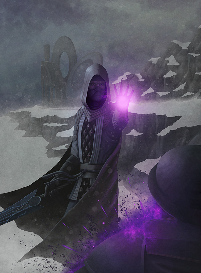 so right from the off I had in my mind 2 light sources, a pale blue from the sky coming in from the top left and then a purple from the dark pact centered on the hand. All the details of the character are just roughly scribbled in with either pale blue or purple right from the off, theres an outline drawing of the clothed figure in black lines somewhere beneath all that. Everything we see is light, you only see a surface when light hits it, so you can think of objects in a scene primarily in terms of direct light hitting them, then work backwards in your head from there filling in the rest with ambient lit areas. With digi vs actual paint... Im nearly 36, so when I took art gcse and went on to art college after it was very much still the world of real paint. At college we would primarily use acrylic and oil, Im probably more versed in actual paint than digital because I used to paint all the time, now Im a graphic designer and I rarely actually do digital painting, its almost all heavy text setting, magazines, brochures etc, and I never really do hands on art any more. but Im very aware of the medium. thing is, theyre different mediums, theres a lot of crossover, but also a lot of ways theyre fundamentally different. I do appreciate what youre trying to do by keeping the methods the same, theres a solid train of thought there. My own personal take is going the other way with it almost, I try and avoid doing digital painting exactly like traditional painting because I dont think the digital can stand up to it through that method. When you paint you can express with the brush, leave in strokes marks, dab and spike with the tip of the brush to leave textured marks, use less paint on the brush so you get a dry scrapey texture, flick the brush to get splats and sprays. When you mix paints your always remixing and getting subtle shade differences, theres a texture left in the paint from the brush, from the canvas or paper, from the build up of layers of paint. Unless you are using an air brush on the most coated piece of card ever and then viewing it in the most ridiculous evenly lit environment then it never just looks flat even if you just painted the entire thing 1 colour straight from the tube. If you take a photo of that flat colour and use an eye dropper in photoshop to sample the colour of it youll find 100 different shades in there. If you just use a fill tool to colour your entire photoshop document red it will be 1 flat colour, horrifically flat. So right away in digital youve lost all the texture, almost all the expression of the brush, all the natural varience in shade that combined to give a really interesting depth to the work. So I feel like when you use the same method, the digital, to my eyes at least, always looks like a shabby imitation. So to replicate the inherently interesting depth of paint within digital you have to start using other methods like scatter brushing, textures, layers with opacities, blending modes, noise distortions, sutff like subtle colour jitters on your brushes... a lot of this replicates what youre getting from paint, but at the same time its done through a very different method, and youre now using tools that are capable of doing stuff you simply cant do with paint if you simply use this blend mode rather than that blend mode etc. The thing is if you use those other modes, you can make an entirely different sort of thing that plays to the strengths of digital and is entirely other, its not longer the pretender to the throne, its an entirely different king in its own right. Depending on how you work with paint though theres a lot of crossover. Do you do underpaintings? How do you go about actually making acrylic paintings, whats the stages? Do you ever use stuff like ink washes? masking fluid? Or do you just go paint straight on a white canvas and done? Ink washes can be a huge thing that you can replicate in real paint and in photoshop with great effect. |
|
" Dead on, sir. Well stated. It's interesting that each time I look at the original commissioned piece, the more "valuable" I find it. Pleasingly imperfect. |
|
|
I hope to get a look when it's finished!
|
|
|
So if I were to start doing commissions.... how much do you suppose I should charge?
I'm starting to get a decently sized portfolio: https://vkmcallister.deviantart.com/gallery/ |


