


[QoL] A more steamlined User-Interface
|
1) Can there be options to hide the Health and Mana orbs, or at least move them both to the center of the screen?
I like being able to see my bottom corners, and if I'm not using health bars - I have to constantly look at a corner to monitor my character's health and flasks, thereby taking awareness off my character's surroundings. If you maintain the art on the orbs and layout of flasks/hotkeys it would still preserve the "PoE signature look" that you all cry about. 2) Can the color of the player/enemy/allies health bars be changed to our liking, much like you can change the color of Premium Stash Tabs? Because having red health orbs, red health flasks, and green health bars triggers my OCD. Something like this, please excuse my award-winning art: 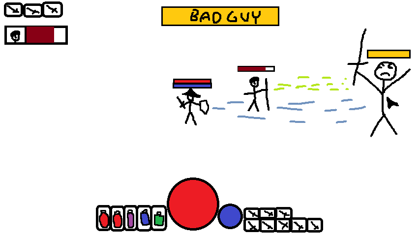 Last edited by mrscabs on Jan 15, 2017, 6:42:41 PM Last bumped on Jan 7, 2017, 11:18:36 AM
| |
|
Dont see why there is not option to just customize the UI as we wish, its 2016 afterall :)
( love your placement tho, i hate how much the UI hides, especially considering i find the UI very boring to look at :(. ) hit me up @sarrow lets have fun :D Last edited by Sawm on Jul 17, 2016, 2:56:26 PM
| |
|
We'll probably get an overhauled UI with 3.0
I can't seem to find the official GGG statement on this. I think Chris mentioned in one of the ZiggyD interviews, that they are planning major UI changes for each major story expansion to fit the current theme of the game. 2.0 e.g. had a massive UI overhaul where they reworked pretty much all of it. (Think of flask sockets, health lions instead of ladies, etc.) If I recall correctly one of the main reasons to not enable personal UI customization was to keep a distinct look and feel to the game. It's probably just an excuse because UI is usually more complex to get working correctly than one might imagine. I personally rather want to have one good interface than the options to customize a mediocre one, a goal the current UI doesn't hold up to unfortunately. |

|
" Has nothing to do with 2016 or whatever,the reason why most games in recent years,especially online ones,are flat out forbidding UI editing of any sort is because of lessons every game dev learned from past online games that allowed UI customization,the UI is supposed to be minimalistic. I agree that the UI atm is kind of a mess,and it buggs me even more that the old theme was removed to appeaste a bunch of randoms who probably don't even play anymore because according to them ''a half naked lady in the corner of my life bar is sexist!'' But yeah,i mean i don't mind the hp/mp and general bottom side outlay,it's classical,and for almost everyone it works perfectly,this isn't an mmorpg after all,but the buff/debuff display/tracking is and always was horrible,tho as the game advances and we get more random auras/debuffs/procs the clutter becomes more and more noticeable. No rest for the wicked. Last edited by Daiena on Oct 2, 2016, 10:31:53 PM
| |
" Fully agree. Customizable UI is often times uncontrollable from a design perspective. " I don't know how to avoid clutter at this stage of the game tbh. The sheer amount of buffs is what makes keeping track impossible. Moving all those icons to a different position on screen wouldn't help much. We'd need a complete overhaul of the way buffs are being displayed. Grouping them might help. Aura's are insignificant compared to temporary buffs, so they shouldn't be as prominent. Debuffs however should be displayed more significantly and pop out more. Corrupted blood is a personal nemesis of mine just because how easy it is to be overlooked. |
|


