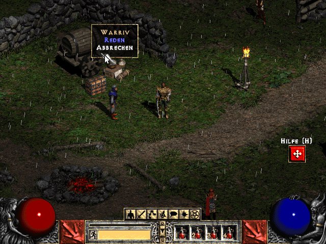
The menu button change is counterintuitive
|
Funny thing is, Diablo 2's UI had the perfect solution: Buttons stay until you click the arrow again. The button locations were much better, too.
 | |
|
Sometimes I use my wireless mouse on the arm of my recliner to play POE, and don't use a keyboard.
The menu change has made it a PITA to open anything because I now have to click twice. For example; I accidentally click an item while holding ALT(hotkey on mouse), now I have to make 2 menu selections to open my inventory to rid myself of a junk item mid-fight. It was much better the way it was before the change. Never wrestle with a pig. You'll only get muddy, and the pig likes it!
Never argue with an idiot. They'll bring you down to their level, and beat you with experience! "De plumber fixes de sync with de wrench." - Robert_Paulson | |
|
A lot of posters have stated that they cannot imagine using a mouse to open the inventory when they can use hotkey.
Fair 'nuff but this is not really the issue the OP is talking about. If you prefer to use the hotkey then the change doesn't really impact you unless of course you just don't like the icons aesthetically. The issue is for those of us that prefer to use the mouse to open menus, the question is whether two clicking is better than trying to single click a small icon. In my case I had no trouble selecting the icon, so the requirement to double click now is a PITA...especially since you have to select the icon anyway after you click the arrow. I now use the hotkeys, but i don't like it. | |
|
I am not a fan of the new ui.
Sure i see the point of the menu button, but it looks ugly hands down. If done well, maybe it would be better, but right now it looks out of place and clumsy. Also i really dislike the recoloring of the ui, it's lost depth to become more metallic mainstream, it's like one of those people who like the really ugly wannabe simplistic wow ui's decided that was a nice and sharp color. It's like plastic, doesn't speak quality to me that color, just speak cheap. I can't help it, it's not a deep color its superficial. It's too eye-glaring, the brownish one was more neutral bringing out the actual gameplay. Just look at the flasks in the OP, they stand much clearer with the old coloring. I am the light of the morning and the shadow on the wall, I am nothing and I am all.
|

|
|
Learn to use hotkeys?
Pants of Textile
| |
"l2r? " And worst change is putting almost all bosses in new version of maps into fucking small areas, where you can't kite well or dodge stuff. What a terrible idiot invented that I want say to him: dude flick you, seriously flick you very much.
| |
|
I swear, if this button gives me carpal tunnel, I'll...I'll...
But seriously, the explanations from the devs on the changes do sound like excuses to me. IGNs
GroovyBeard JooJooFromTheWell |

|
|
Wait. There used to be buttons there? Like buttons that opened stuff? Because I've never used anything except the hotkeys.
Why were there buttons? Why is there a button? So redundant. Hotkeys exist. IGN - PlutoChthon, Talvathir
| |
|
We are not talking about hotkeys. Are you stupid people? We are talking about the clickable things. Who prefer hotkeys just move along, this thread is not for you. Do you understand?
If I dont reply to you - I dont give a flying duck about your opinion
If you dont reply to me - I dont care either because I dont come back to see who replied to me |

|
|
Aye it aint bout keys its about the stupid button, it just adds a click which sucks.
I use buttons rarely, when i have a cuppa coffee in my left hand for instance. But fact is that i want the old buttons back cus they were better! |


